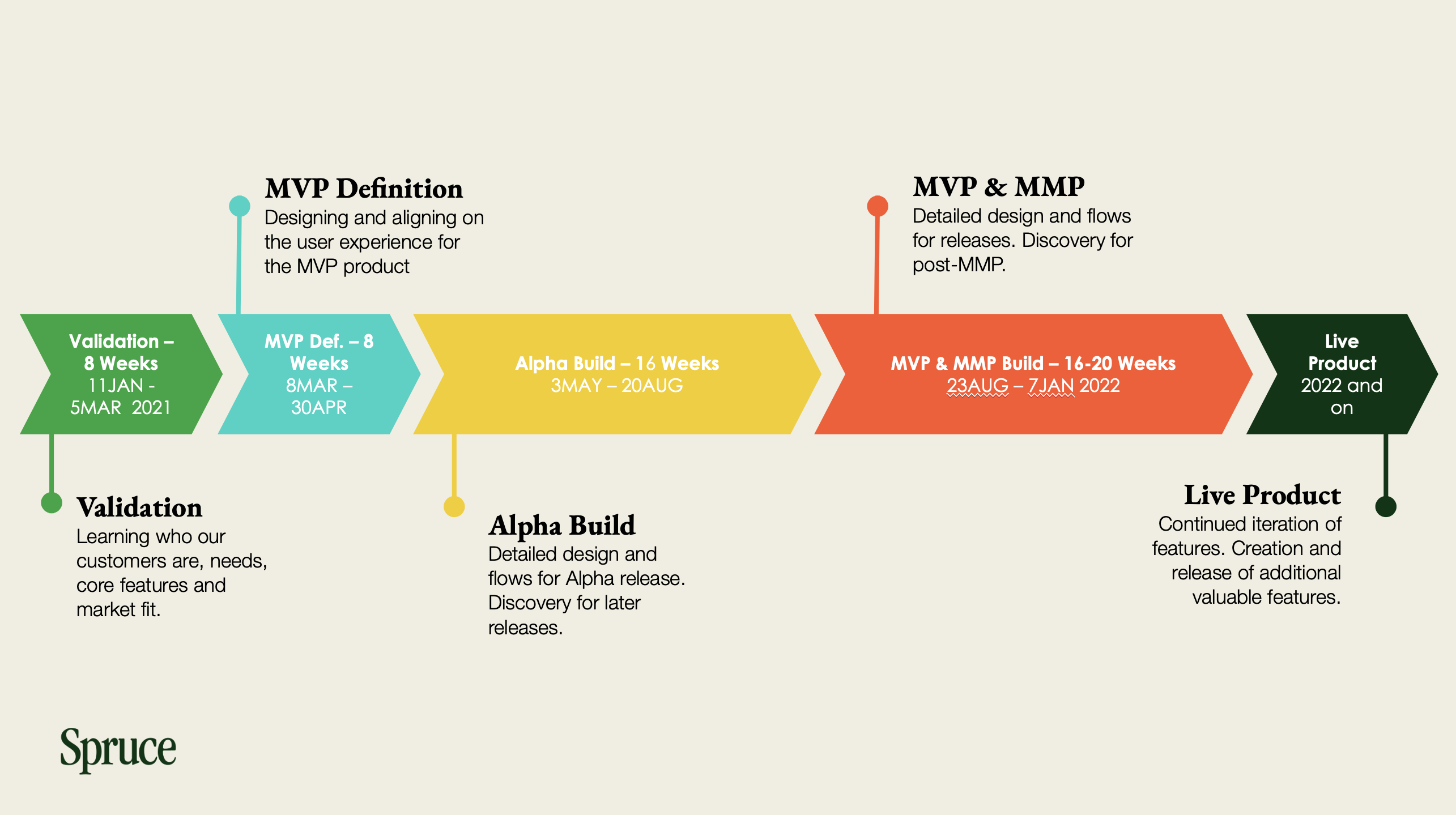
H&R Block wanted to compete in the saturated challenger banking space, but with a real point of difference: meaningful value for financially overlooked communities. The product needed to balance financial empowerment with ease of use, and seamlessly extend beyond H&R Block's traditional tax customer base.
As a design leader on the founding team, I helped guide Spruce from initial concept to public launch, driving all aspects of product design, from early research and user validation to high-fidelity prototyping and developer handoff. I implemented a research-backed UX strategy, facilitated roadmap planning with senior leadership, and contributed to a scalable design system that empowered development.
My work helped unify teams across an agile startup culture and a traditional enterprise structure, ultimately contributing to a successful product launch within a year.
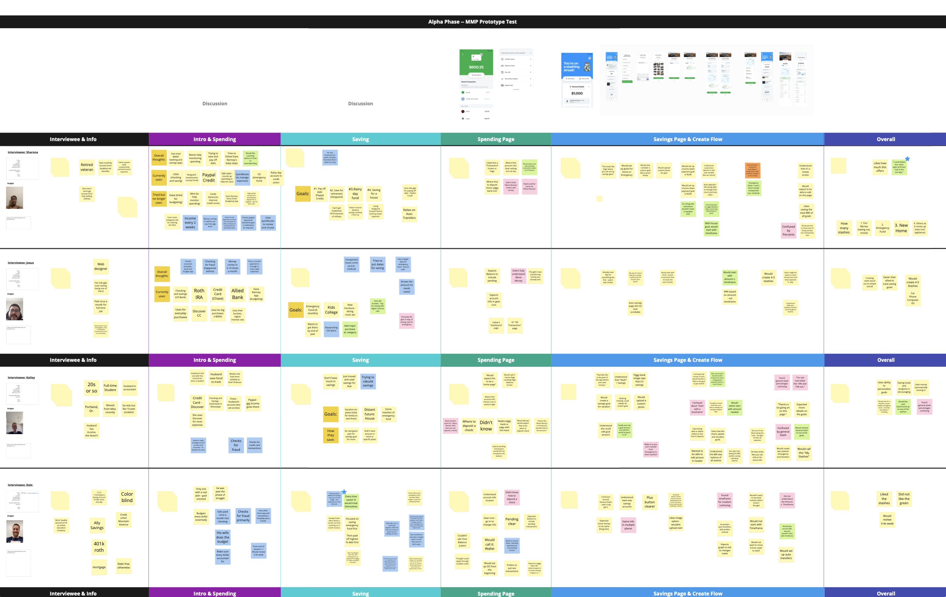
I helped establish a recurring cadence of qualitative interviews, usability tests, and concept walkthroughs with target users, including remote ethnographic interviews to identify underserved pain points and concept testing with divergent value propositions.
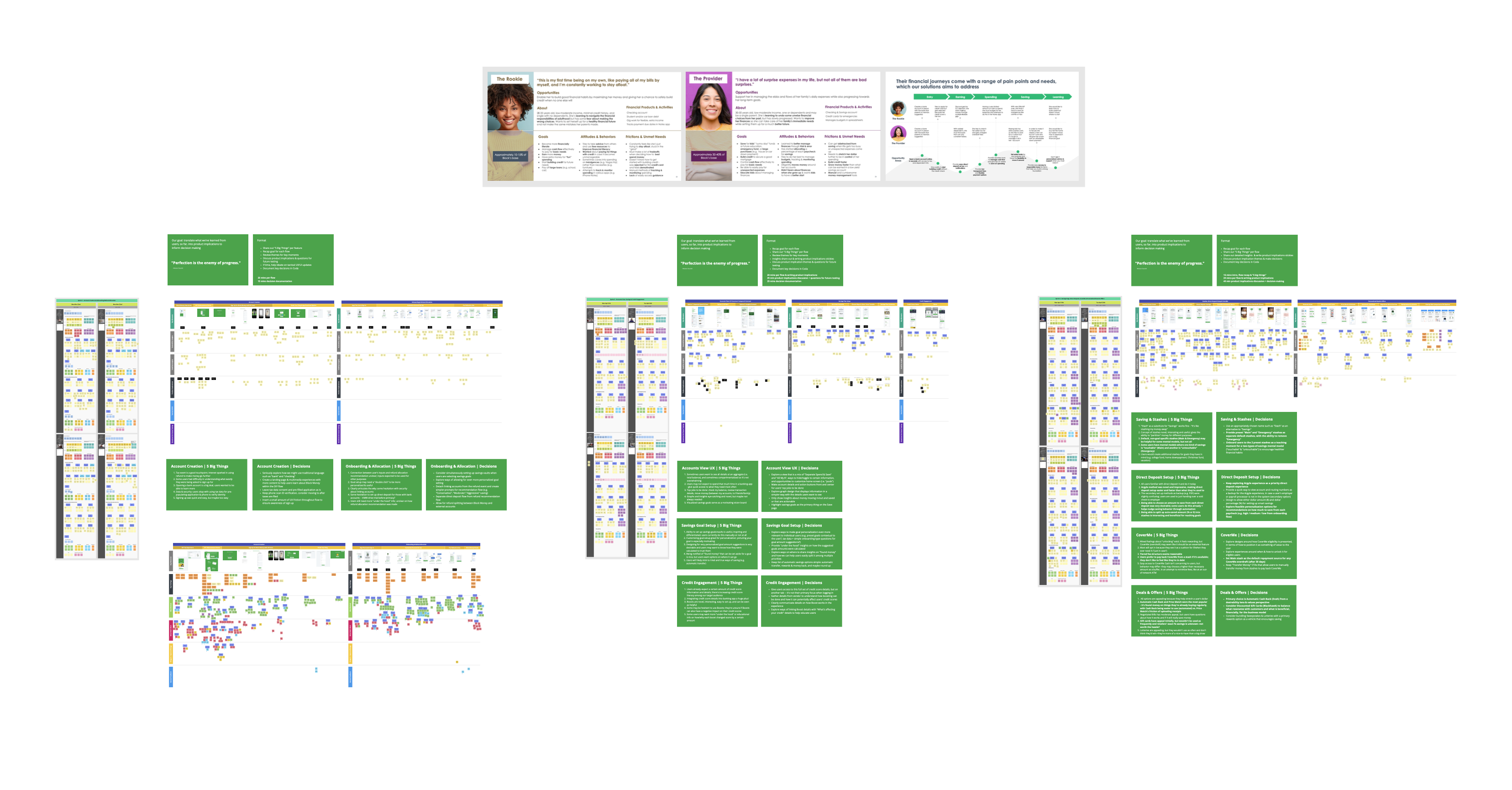
Regular synthesis workshops using Miro aligned insights across the team. This process spanned multiple rounds of qualitative interviews, concept tests, and usability sessions, informing everything from MVP features to nuanced UI decisions, and keeping us anchored in real user needs throughout the entire lifecycle.
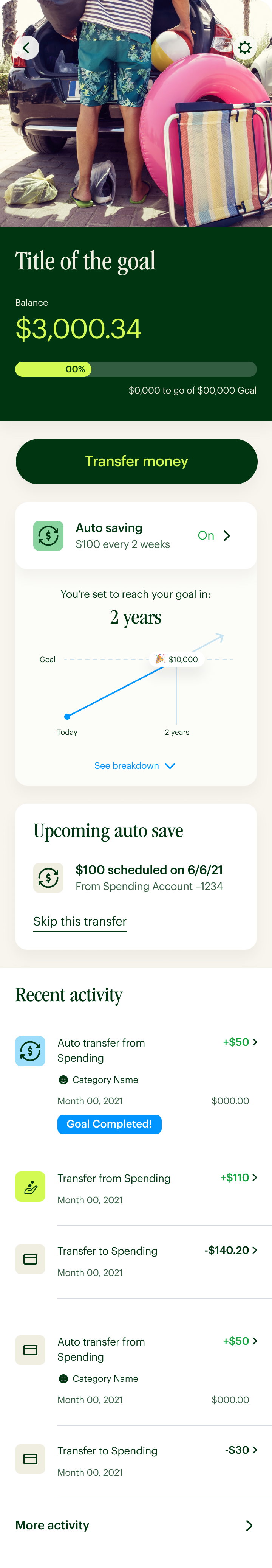
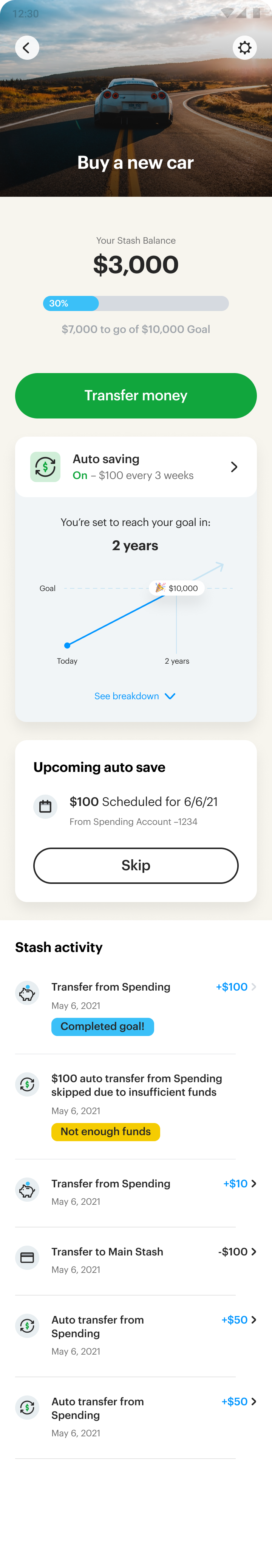
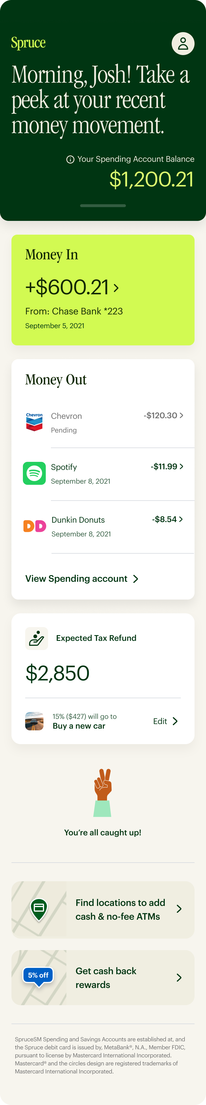
We ran collaborative design sprints to explore a range of possible solutions and held prioritization sessions with product and engineering to identify those with the highest potential impact. We collectively defined the MVP based on desirability, feasibility, and viability, and worked closely with senior and C-level leadership to map out a phased rollout strategy. This early alignment on both vision and execution enabled a smooth, iterative build-up to a successful public launch.
To support fast build cycles without sacrificing cohesion, the team evolved from the H&R Block design system to a distinct visual identity for Spruce. We introduced custom components, reusable patterns, and a shared Figma library tailored to the product's evolving needs.
Foundational design tokens and clear documentation were created to streamline developer implementation and minimize design debt across the board. Below are examples of screens that went from the initial incubation designs in the H&R Block system to the new Spruce system.
We designed "My Life" to transform the homepage from a static dashboard into a smart, supportive hub. Through multiple rounds of moderated usability testing with real users across income levels and financial confidence levels, one truth kept surfacing: people didn't want more information. They wanted the right information, immediately visible.
The result was a context-aware experience that surfaced timely alerts, reminders, and insights, nudging users toward better financial habits and helping them feel more in control of their money.
Before landing on "My Life," we explored four distinct directions for the homepage. Each option balanced information density, visual hierarchy, and user goals differently. Click any screen to toggle between Home and Spending views.
One of the most rewarding aspects of working on Spruce was collaborating with a diverse and talented team. Leadership often meant listening, facilitating, and fostering a shared vision. Together, we cultivated a culture rooted in open communication, continuous research, constructive critique, and a shared pursuit of excellence.
Navigating the broader organizational structure came with its challenges. While the Spruce team operated with an agile mindset, H&R Block adhered to a more traditional waterfall approach. Bridging these two cultures required empathy, adaptability, and clear communication, protecting the momentum and ethos of the product team while aligning effectively with cross-division partners and enterprise stakeholders.
Spruce launched in under 12 months, attracting 160K+ users in year one and surpassing early adoption targets. That kind of outcome doesn't happen by accident. It happens when research, design, and engineering are aligned from day one and stay that way through launch.
The technical constraints were real. Navigating a hybrid (Ionic) framework meant solving problems creatively at every turn. But the culture we built around openness, critique, and collaboration made us resilient. The product was the result. The team was the reason.